
CSS is the backbone of beautiful and interactive web designs. Advanced CSS techniques enhance the user experience by making your websites dynamic, responsive, and visually appealing. Let’s dive into each topic with practical examples. In this blog, we’ll explore CSS Counters, Pseudo-Classes (:has() and :not()), the resize property, and linear gradients on text.
1. CSS Counters: Dynamic Numbering
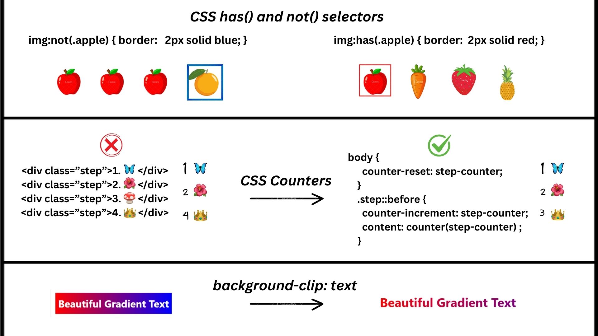
If you’re looking to add automatic numbering to things like ordered content such as lists, steps, or chapters without manually updating numbers to your web designs, then CSS counters are a fantastic way to do it without using JavaScript or hardcoding numbers.
What Are CSS Counters?
CSS counters are like variables in CSS that allow you to add, reset, and display numbers dynamically in your design
Key Properties
- counter-reset: Initializes or resets a counter.
- counter-increment: Increases the counter’s value.
- content: Insert the counter’s value (or other content) into the page.
Beginner’s Approach (Without Counters)
When starting out, you may manually hardcode numbers using HTML and CSS. Here’s a simple example of creating a numbered list without using CSS counters.
Example: Numbered List Without Counters
<!DOCTYPE html>
<html lang="en">
<head>
  <meta charset="UTF-8">
  <meta name="viewport" content="width=device-width, initial-scale=1.0">
  <title>Manual Numbering</title>
  <style>
    /* Styling the list */
    .item {
      font-weight: bold;
      margin-bottom: 10px;
    }

    .number {
      color: #1e90ff;
      margin-right: 5px;
    }
  </style>
</head>
<body>
  <div class="item">
    <span class="number">1.</span> Apples  // Manualy adding numbers
  </div>
  <div class="item">
    <span class="number">2.</span> Bananas
  </div>
  <div class="item">
    <span class="number">3.</span> Cherries
  </div>
</body>
</html>
Result
Pro Approach: Automating Numbers with CSS Counters
CSS Counters dynamically handle numbering, saving time and improving maintainability.
Example: Automatic Step Numbering with CSS
<!DOCTYPE html>
<html>
<head>
  <meta charset="UTF-8">
  <meta name="viewport" content="width=device-width, initial-scale=1.0">
  <title>Dynamic Numbering</title>
  <style>
    body {
      counter-reset: step-counter; /* Initialize counter */
    }
    .step::before {
      counter-increment: step-counter; /* Increment counter */
      content: counter(step-counter) ". "; /* Display counter value */
      font-weight: bold;
      color: #1e90ff;
      margin-right: 5px;
    }
    .step {
      margin: 10px 0;
    }
  </style>
</head>
<body>
  <div class="step">Open the browser</div>
  <div class="step">Search for "CSS Tricks"</div>
  <div class="step">Read this guide</div>
</body>
</html>
Result
Why Use CSS Counters?
- SEO Benefit: Automated numbering keeps content logically structured, improving readability for search engines.
- Ease of Use: Add or reorder steps without modifying numbers manually.
2. CSS Pseudo-Classes :has() and :not() : Dynamic Styling Made Easy
The :has() and :not() pseudo-classes are powerful tools in CSS that allow you to target elements based on their contents or the presence of other elements inside them.
Beginner’s Approach (Without has())
Let’s say you want to style a list item based on whether it contains a specific element (like a link), or style a button unless it has a certain class.
Example: Simple Selection Without :has()
<style>
 .highlight {
    color: blue;
    font-weight: bold;
  }
</style>

<ul>
  <li class="highlight"><a href="#">Link 1</a></li>
  <li>Plain Item</li>
</ul>
Result
- Link 1
- Plain Item
Pro Approach: Use :has() for Dynamic Styling
The :has() pseudo-class selects a parent element if it contains certain child elements. This is particularly useful when applying styles to a parent based on its children, something CSS couldn’t traditionally do without JavaScript.
Example: Styling a List Item Containing a Link
<style>
  li:has(a) {
    color: blue;
    font-weight: bold;
  }
</style>
<ul>
  <li><a href="#">Link 1</a></li>
  <li>Plain Item</li>
</ul>
Result
- Link 1
- Plain Item
Why Use :has()?
- Eliminates extra HTML classes.
- Dynamically applies styles based on content.
Pro Approach: Excluding Items with :not()
The :not() pseudo-class excludes specific elements from a selection.
Example: Style Non-Disabled Buttons
<style>
  button:not(.disabled) {
    background-color: green;
    color: white;
    cursor: pointer;
  }
  button.disabled {
    background-color: gray;
    cursor: not-allowed;
  }
</style>
<button>Enabled Button</button>
<button class="disabled">Disabled Button</button>
Result
Why Use :not()?
- Cleanly excludes elements from styling.
- Simplifies logic for conditional designs.
3. Linear Gradients on Text: Stunning Visual Effects
Linear Gradient on Text in CSS is a type of linear gradient in which the text is filled with colour. Text gradient CSS is very easy to implement, has wonderful visual effects, very useful tool for our website if we know how to create a text gradient effect with our text.
Beginner Approach: Gradient Background
Many beginners apply gradients as backgrounds instead of directly on the text.
Example: Gradient Background
<style>
  .gradient-background {
    background: linear-gradient(to right, red, blue);
    color: white;
    padding: 10px;
    display: inline-block;
  }
</style>
<div class="gradient-background">Beautiful Gradient Text</div>
Result
Pro Approach: Gradient Text with background-clip
With -webkit-background-clip and -webkit-text-fill-color, apply gradients directly to the text.
Example: Stunning Gradient Text
<style>
  .gradient-text {
    background: linear-gradient(to right, red, blue);
    -webkit-background-clip: text;
    -webkit-text-fill-color: transparent;
    font-size: 36px;
    font-weight: bold;
  }
</style>
<h1 class="gradient-text">Beautiful Gradient Text</h1>
Result
Beautiful Gradient Text
Why Use Gradient Text?
- Creates visually stunning headers and titles.
- Boosts user engagement with dynamic designs.
4. The Resize Property: Interactive Resizing
The resize property allows your users to resize elements interactively like text areas or containers manually by dragging their edges. With some detailed knowledge about resizing, beginners and advanced users can style this behavior differently.
Beginner Approach: Default Resizing
Beginners often rely on default browser behavior for resizing elements. They use the resize property without much customization and focus on simple use cases.
Example: Resizable Text Area
 <style>
    /* Enable resizing for the text area */
    textarea {
      width: 300px;
      height: 150px;
      resize: both; /* Allow resizing both horizontally and vertically */
      overflow: auto; /* Ensure scrollbars appear when content overflows */
    }
  </style>
<body>
  <h1>Resizable Text Area</h1>
  <textarea placeholder="Type something..."></textarea>
</body>
Result
Resizable Text Area
Explanation:
- resize: both Allows the user to resize the element in both horizontal and vertical directions.
- Default Behavior: Relies on the browser’s built-in resize handles.
Pro Approach: Custom Resizing
Control resizing directions and dimensions for a better user experience
Example: Horizontal Resizing with Constraints
<style>
  .resizable {
    resize: horizontal; /* Restrict to horizontal resizing */
    overflow: hidden;
    min-width: 200px;
    max-width: 600px;
    padding: 10px;
    border: 1px solid #ccc;
  }
</style>
<div class="resizable">Resize me horizontally only!</div>
Result
Why Use Resizing?
- Improves interactivity for user input.
- Prevents distorted layouts with restricted dimensions.
5. CSS Scroll-Snap: Easy Scrolling for Sliders and Carousels (Boost User Engagement)
CSS Scroll-Snap allows smooth and effortless scrolling experiences in sliders, carousels, and lists. It ensures that users come to a stop at the appropriate points while scrolling, enhancing the usability and enjoyment of your website.
What Is CSS Scroll-Snap?
Scroll-snap creates “sticky” stops in a scrollable area, similar to flipping through the pages of a book or sliding through images in a gallery. This feature gives users a sense of control, helping them navigate without feeling lost while scrolling.
Main Features of CSS Scroll-Snap
scroll-snap-type
This property is applied to the main container to control the snapping behavior. For instance, using scroll-snap-type: x mandatory; ensures that the section snaps to each item in a horizontal direction.
scroll-snap-align
This is added to each item to decide how they snap into place. It tells the browser where to stop the scroll for each item.
scroll-padding
This adds space around the snap points, so the scrolling feels smooth and doesn’t stop too abruptly.
Beginner’s Way (Without Scroll-Snap)
When starting out, you might create sliders using JavaScript or regular CSS. While they work, they don’t always have smooth snapping, and users might find it hard to navigate.
Example: Basic Slider Without Scroll-Snap
<!DOCTYPE html>
<html>
<head>
  <style>
    .container {
      display: flex;
      overflow-x: scroll;
      scroll-behavior: smooth;
    }
    .item {
      flex: 0 0 100%;
      background-color: #f0f0f0;
      text-align: center;
      padding: 50px 20px;
    }
  </style>
</head>
<body>
  <div class="container">
    <div class="item">Slide 1</div>
    <div class="item">Slide 2</div>
    <div class="item">Slide 3</div>
  </div>
</body>
</html>
Result
Explanation:
A horizontal slider that users can scroll through manually. It doesn’t stop neatly on each slide.
Pro Way: Smooth and Snapping Slider Using CSS Scroll-Snap
With CSS Scroll-Snap, you can create sliders that snap perfectly into place. This makes the design feel more polished and easier for users to navigate.
Example: Smooth Slider with Scroll-Snap
<!DOCTYPE html>
<html>
<head>
  <style>
    /* Main scrollable area */
    .container {
      display: flex;
      overflow-x: scroll; /* Enables horizontal scrolling */
      scroll-snap-type: x mandatory; /* Ensures items snap horizontally */
      gap: 10px; /* Adds space between items */
      scroll-behavior: smooth; /* Makes the scrolling smooth */
    }

    /* Each item in the slider */
    .item {
      flex: 0 0 100%; /* Each slide takes up the full width */
      scroll-snap-align: center; /* Makes items snap in the center */
      background-color: #f0f0f0; /* Light background for items */
      text-align: center; /* Centers text inside the item */
      padding: 50px 20px; /* Adds padding around content */
    }

    /* Optional: Style the body for better presentation */
    body {
      margin: 0;
      font-family: Arial, sans-serif;
    }
  </style>
</head>
<body>
  <div class="container">
    <div class="item">Slide 1</div>
    <div class="item">Slide 2</div>
    <div class="item">Slide 3</div>
  </div>
</body>
</html>
Result
Explanation:
- scroll-snap-type: x mandatory
This tells the browser to make the slider snap horizontally and stop at each item. - scroll-snap-align: center
Each item snaps into place at the center of the viewport, making it easier for users to focus on the content. - scroll-behavior: smooth
This makes the slider feel more polished by adding smooth scrolling animations. - gap: 10px
Adds space between the items to make the slider look cleaner.
Why Use CSS Scroll-Snap?
- Better User Experience: Makes sliders and carousels more intuitive.
- Improved Engagement: Users can easily focus on one item at a time.
- SEO Boost: Smooth scrolling and easy navigation keep users on your site longer.
6. Custom @supports Queries: Make Modern Features Work with Old Browsers
While creating websites, some CSS features work only in the latest browsers. To make sure your site works for everyone, you can use @supports in CSS. This helps you create beautiful designs that look great on new browsers without breaking for people using older ones. It’s like giving everyone the best experience possible, no matter what device they’re on.
What Are Custom @supports Queries?
The @supports rule is like a question for the browser: “Do you understand this feature?” If the answer is yes, the browser uses the advanced design. If not, it uses a simpler fallback design.
Key Parts of @supports
1. @supports Rule
The @supports rule checks if a CSS feature is available. For example:
@supports (display: grid) {
  /* Advanced styles for browsers with Grid */
}
2. Fallback Styles
If a browser doesn’t understand the feature, it ignores the styles inside @supports and uses the fallback styles instead.
Beginner’s Way (Without @supports)
If you don’t use @supports, you might avoid new CSS features altogether to ensure your design works everywhere.
Example: Basic Layout Without Modern Features
.container {
  display: flex; /* Simple layout for all browsers */
  gap: 10px;
}
This works fine but doesn’t let you use advanced tools like CSS Grid.
Pro Way: Using @supports for Advanced Layouts
With @supports, you can mix simple and advanced layouts. Older browsers will use the fallback, and modern ones will use the advanced design.
Example: Using Grid with Fallback
.container {
  display: flex; /* Fallback layout */
  gap: 10px;
}

@supports (display: grid) {
  .container {
    display: grid;
    grid-template-columns: repeat(3, 1fr);
    gap: 20px;
  }
}
Explanation:
- Fallback Styles: The
display: flex;ensures older browsers show a basic layout. - Advanced Styles: Inside
@supports,display: grid;adds modern grid layouts. - Equal Columns:
1frmeans each column takes up equal space.
What Does 1fr Mean?
In simple words, 1fr means “1 fraction of the available space.” For example:
- If you have 3 columns with
grid-template-columns: repeat(3, 1fr);, each column gets 1/3 of the total width. - It’s a great way to split space evenly without calculating pixel sizes.
Why Use Custom @supports Queries?
- Works Everywhere: Your website looks good on all browsers, new or old.
- Future-Ready: Use new CSS features without breaking your design for older users.
- Better for SEO: A smooth experience keeps users happy, reducing bounce rates.
Real great visual appeal on this website , I’d rate it 10 10.