
If you’ve been coding for a while, you might remember how difficult it was to create popovers. Popovers are small floating UI elements like tooltips, dropdowns, or modals.
Before the Popover API, we had to rely on a combination of CSS, JavaScript, and sometimes third-party libraries. This approach made the code bulky and difficult to manage. Handling events was tricky, and behavior often varied across different browsers.
Developers had to manually control visibility, positioning, and accessibility. This process was time-consuming and prone to errors.
But things have changed! HTML now provides a built-in solution to simplify our work. The Popover API is a powerful addition that makes popover management easier, more intuitive, and much more efficient.
And that’s not all! Another incredible built-in feature, the Dialog API, makes creating modals simpler than ever. Let’s dive into how both APIs can make your life as a developer easier. 🚀
The Old Ways: A Messy Cocktail of CSS and JavaScript
Popovers Before the API
Before the Popover API, adding a simple popover required juggling multiple techniques. Here’s an example using JavaScript and CSS:
<button id="btn">Click me</button>
<div id="popover" class="hidden">Hello, I’m a popover!</div>

<style>
  .hidden { display: none; }
  .popover {
    position: absolute;
    background: white;
    border: 1px solid #ccc;
    padding: 10px;
    box-shadow: 2px 2px 10px rgba(0, 0, 0, 0.1);
  }
</style>

<script>
  const button = document.getElementById("btn");
  const popover = document.getElementById("popover");

  button.addEventListener("click", () => {
    popover.classList.toggle("hidden");
    popover.classList.toggle("popover");
  });
</script>
This method had several downsides:
- You had to manage showing/hiding manually.
- Positioning was tricky.
- Accessibility was often overlooked.
- Additional CSS and JavaScript were required for animations or dismiss behavior.
The New Way: Meet the Popover API
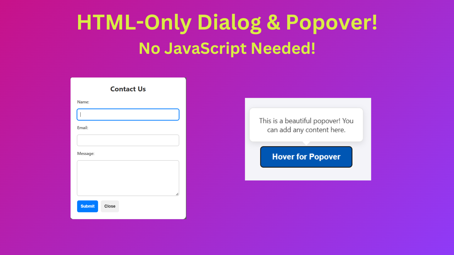
Now, let’s look at how HTML alone can handle this with the Popover API:
<button popovertarget="myPopover">Click me</button>
<div id="myPopover" popover> Hello, I’m a popover! </div>Yes, that’s it! No JavaScript required.
How It Works
- The
popoverattribute makes an element act like a popover. - The
popovertargetattribute on the button tells the browser which element to toggle. - Browsers handle positioning, dismissing, and accessibility automatically.
Why This Is a Big Deal
- Less Code – No need for extra JavaScript or CSS tricks.
- Built-in Accessibility – Focus management and keyboard navigation work out of the box.
- Better Performance – No reliance on third-party libraries.
- Consistency – Browsers handle popovers in a predictable way.
Bonus: Controlled Popovers
Want more control? You can trigger popovers manually in JavaScript:
<button id="btn" popovertarget="myPopover">Click me</button>
<div id="myPopover" popover> Hello, I’m a popover! </div>

<script>
  const popover = document.getElementById("myPopover");
  popover.showPopover(); // Opens popover
  popover.hidePopover(); // Closes popover
</script>The Old Ways: Creating Modals Before the Dialog API
Before the Dialog API, implementing a modal required a mix of HTML, CSS, and JavaScript:
<button id="openModal">Open Modal</button>
<div id="modal" class="hidden overlay">
  <div class="modal-content">
    <p>Hello! I'm a modal.</p>
    <button id="closeModal">Close</button>
  </div>
</div>

<style>
  .hidden { display: none; }
  .overlay {
    position: fixed;
    top: 0; left: 0;
    width: 100%; height: 100%;
    background: rgba(0, 0, 0, 0.5);
    display: flex;
    justify-content: center;
    align-items: center;
  }
  .modal-content {
    background: white;
    padding: 20px;
    border-radius: 5px;
  }
</style>

<script>
  const modal = document.getElementById("modal");
  document.getElementById("openModal").addEventListener("click", () => modal.classList.remove("hidden"));
  document.getElementById("closeModal").addEventListener("click", () => modal.classList.add("hidden"));
</script>
This method had several issues:
- Extra JavaScript to manage visibility.
- Additional CSS for styling and positioning.
- Handling keyboard navigation and focus manually.
The New Way: Meet the Dialog API
Now, let’s look at how HTML alone can handle this with the Dialog API:
<button onclick="document.getElementById('myDialog').showModal()">Open Modal</button>
<dialog id="myDialog">
  <p>Hello! I'm a modal.</p>
  <button onclick="this.parentElement.close()">Close</button>
</dialog>How It Works
- The
<dialog>element creates a modal natively. - The
showModal()method displays it as a modal. - The
close()method hides it. - Automatically blocks background interaction and manages focus.
- Supports form submission natively with the
method="dialog"attribute.
Modal vs. Non-Modal Dialogs
showModal()creates a modal dialog that prevents interaction with the background.show()creates a non-modal dialog, allowing users to interact with the rest of the page.
<dialog id="nonModal">
  <p>I'm a non-modal dialog.</p>
  <button onclick="this.parentElement.close()">Close</button>
</dialog>
<button onclick="document.getElementById('nonModal').show()">Open Non-Modal</button>Adding a Backdrop
You can style the modal backdrop using the ::backdrop pseudo-element:
dialog::backdrop {
  background: rgba(0, 0, 0, 0.5);
}
Handling Form Submission in Dialogs
Forms inside <dialog> elements can be submitted easily without JavaScript. When a user submits the form, the dialog closes automatically, and you can retrieve the form data using JavaScript:
<dialog id="formDialog">
  <form method="dialog">
    <label for="name">Name:</label>
    <input type="text" id="name" name="name" required>
    <button type="submit">Submit</button>
  </form>
</dialog>

<button onclick="document.getElementById('formDialog').showModal()">Open Form</button>To capture form data:
const dialog = document.getElementById("formDialog");
dialog.addEventListener("close", () => {
  console.log("Dialog closed with value:", dialog.returnValue);
});
Wrapping Up
The Popover and Dialog APIs simplify what used to be a hassle. Instead of writing extra JavaScript and CSS, we now have native, efficient, and accessible ways to handle popovers and modals. Less code, more productivity!
So, what do you think? Ready to ditch the old ways and embrace these modern approaches?
MZSpP wWux vngVN
Someone essentially lend a hand to make seriously posts I’d state.
That is the very first time I frequented your web page and so far?
I amazed with the analysis you made to create this actual submit incredible.
Magnificent job!
Thank you…!
I like what you guys are up too. Such smart work and reporting! Keep up the superb works guys I have incorporated you guys to my blogroll. I think it will improve the value of my site :).
Thanks for your feedback. Keep in touch & support us.